
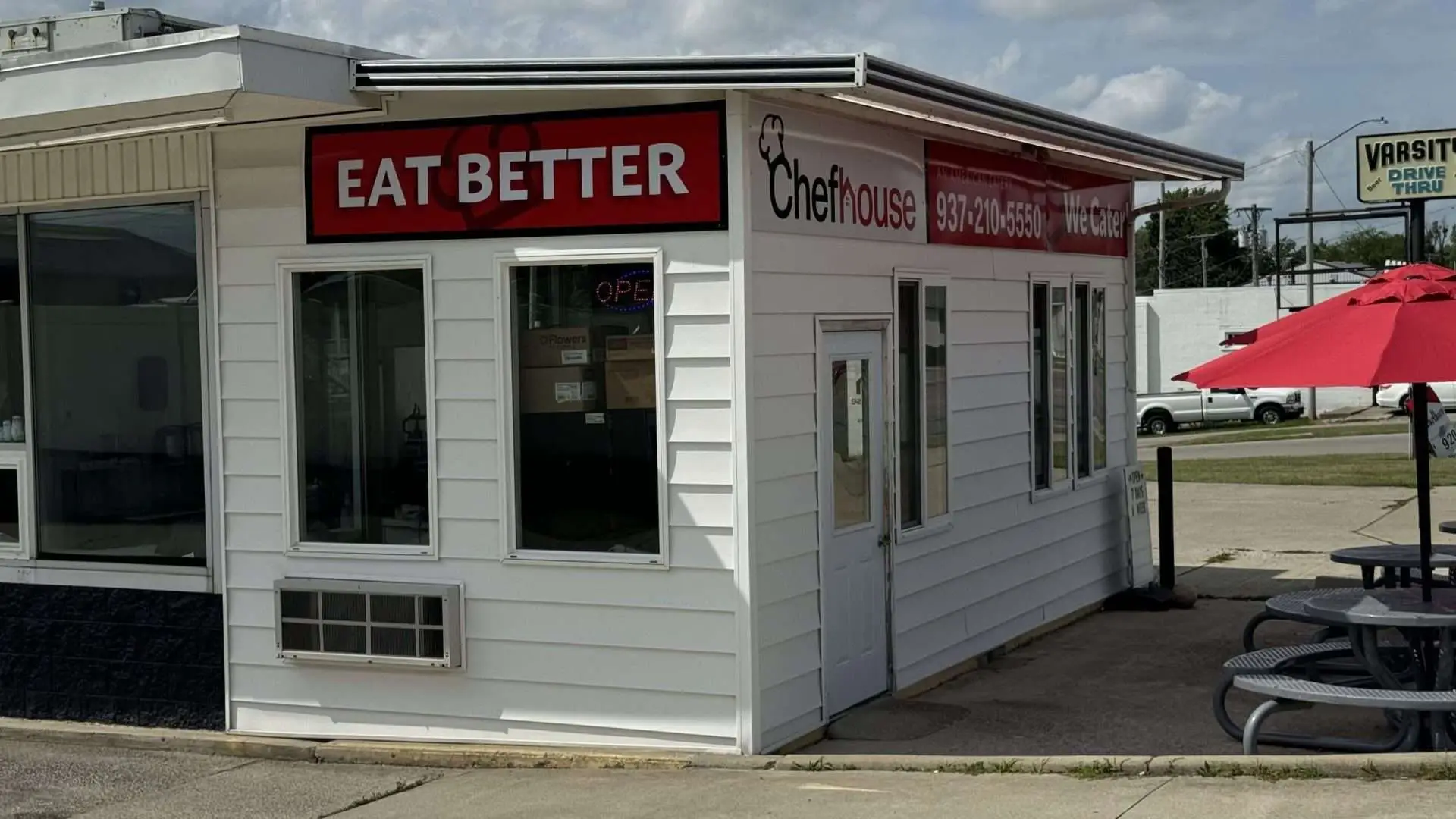
ChefHouse has always been a gem on Main Street, known for its delicious, fresh, and healthy options, but for a long time, the restaurant struggled to get the visibility it deserved. Tucked away without prominent signage, ChefHouse wasn’t catching the attention of potential customers walking or driving by. They had the product and the quality, but they were missing the presence that would help them stand out in a busy area.
When Galen and I met with the ChefHouse team, we knew that we needed something more than just a sign. We needed a message that would resonate with people, something that would stick in their minds long after they passed by. After brainstorming and diving into what makes ChefHouse unique, we came up with the simple but powerful slogan Eat Better . With ChefHouse’s focus on wholesome ingredients and balanced meals, Eat Better had a dual meaning. For regulars, it was a call to action: “choose better options and enjoy great food.” For those who hadn’t tried ChefHouse yet, it created a sense of “I should’ve eaten better,” encouraging them to make ChefHouse their next stop.
The new signage went up, big and bold, right outside ChefHouse, and the impact was immediate and astounding. Within the first week, ChefHouse hit back-to-back record-breaking sales days—proof that the community was finally noticing this exceptional spot. And it wasn’t just in person; we shared photos of the new signs and fresh look on Facebook, and the post exploded with organic reach, garnering over 10,000 views—ten times their typical engagement. Customers shared their excitement, and even Chef Will joined the conversation, commenting, “Thank you so much! We feel seen!”
The change was more than just numbers. This project reminded us why we love what we do: helping great businesses connect with their communities and build the visibility they deserve. ChefHouse’s new signs are a reminder that sometimes, with the right message and just the right look, a brand can speak to its customers in ways that go beyond words. We’re thrilled to have been a part of ChefHouse’s journey to become a Main Street favorite.
If your business needs a visibility boost or a refreshed message that resonates, get in touch! Let’s bring your brand to life and make sure your business gets seen.
More Case Studies
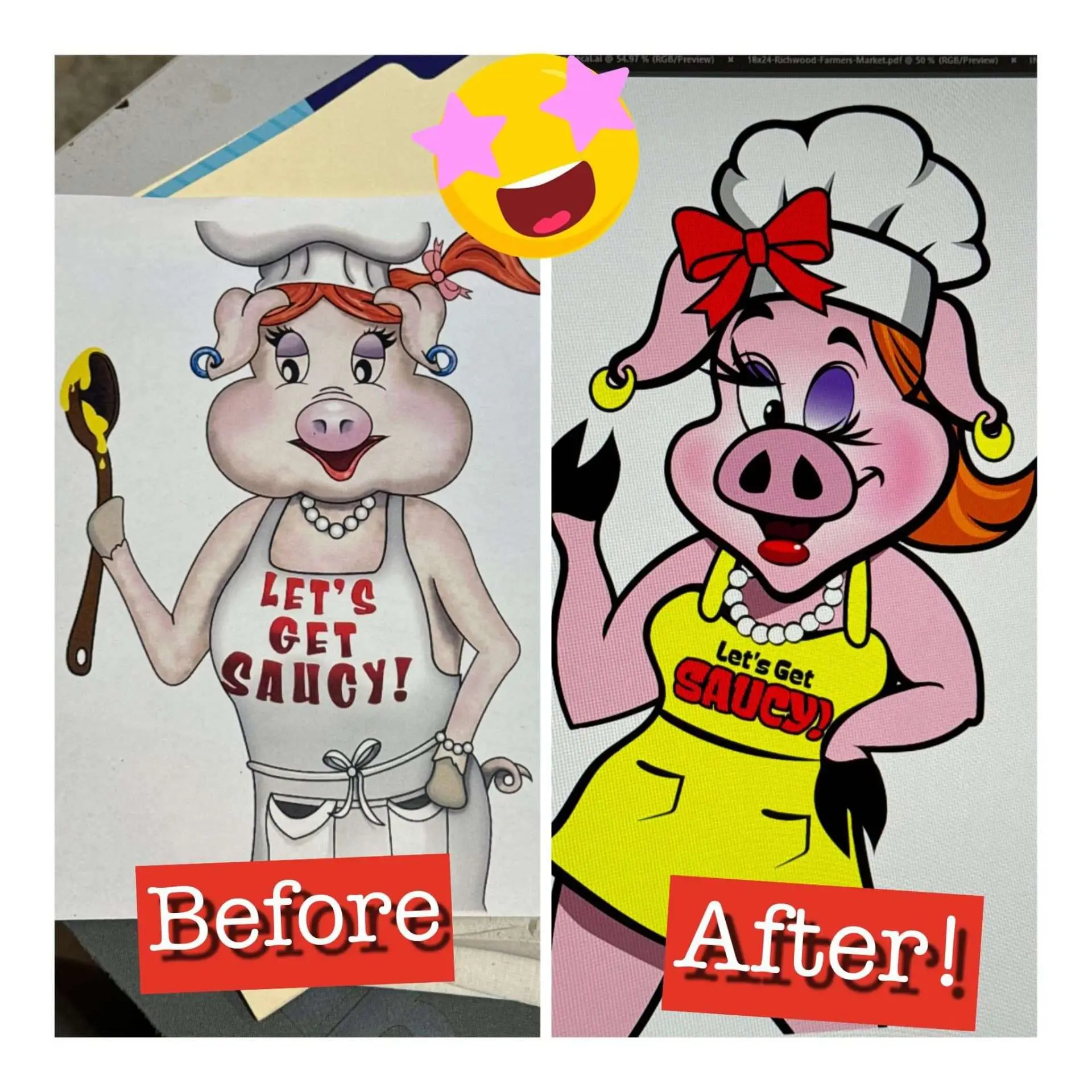
Breathing New Life into a Classic Brand: Saucy Sows Mascot Redesign
Nearly 1,500 reactions to one Facebook post! Saucy Sows has been a beloved brand for years, but Scott and Denise realized their mascot needed an update to better reflect their brand’s personality and appeal to today’s audience. They approached us with the goal of refreshing their iconic mascot while staying true to the Saucy Sows […]
Learn more →
Building Credibility from the Ground Up: Spartan Junk Removal’s Complete Brand Transformation
When Daylon Easton launched Spartan Junk Removal, his business quickly gained traction, but the brand’s identity was scattered and didn’t reflect the strength and professionalism he wanted to project. Daylon initially created his logo with AI, but as his business grew, he recognized the need for a cohesive brand that would convey credibility from the […]
Learn more →