

When Daylon Easton launched Spartan Junk Removal, his business quickly gained traction, but the brand’s identity was scattered and didn’t reflect the strength and professionalism he wanted to project. Daylon initially created his logo with AI, but as his business grew, he recognized the need for a cohesive brand that would convey credibility from the start.
For a smaller business like Spartan Junk Removal, first impressions are everything. We knew that creating a strong, unified brand would make an immediate impact, helping customers see Spartan as a trustworthy and reliable choice. To bring this vision to life, we started with the basics: a logo that captured Spartan’s strength and a color scheme that projected both professionalism and approachability. We added a tagline that resonated with Daylon’s mission and values, grounding the brand with purpose.
But we didn’t stop there. We created a new website ( callthespartans.com ), social media badge and cover photo to boost online presence, business cards to leave a lasting impression, yard signs for strategic visibility, and custom lettering for his trailer and truck. This full branding package ensured that every touchpoint—from social media to the truck on the job—told the same story of strength, reliability, and professionalism.
The transformation was striking. Spartan Junk Removal now stands out as a polished, credible business that customers can trust at a glance. With a cohesive look and professional branding, Daylon now has the tools to make a strong impression and build his business’s reputation in the community.
Ready to give your business a brand identity that speaks volumes? Contact us today to create a unified, impactful brand package that helps your business grow.
More Case Studies
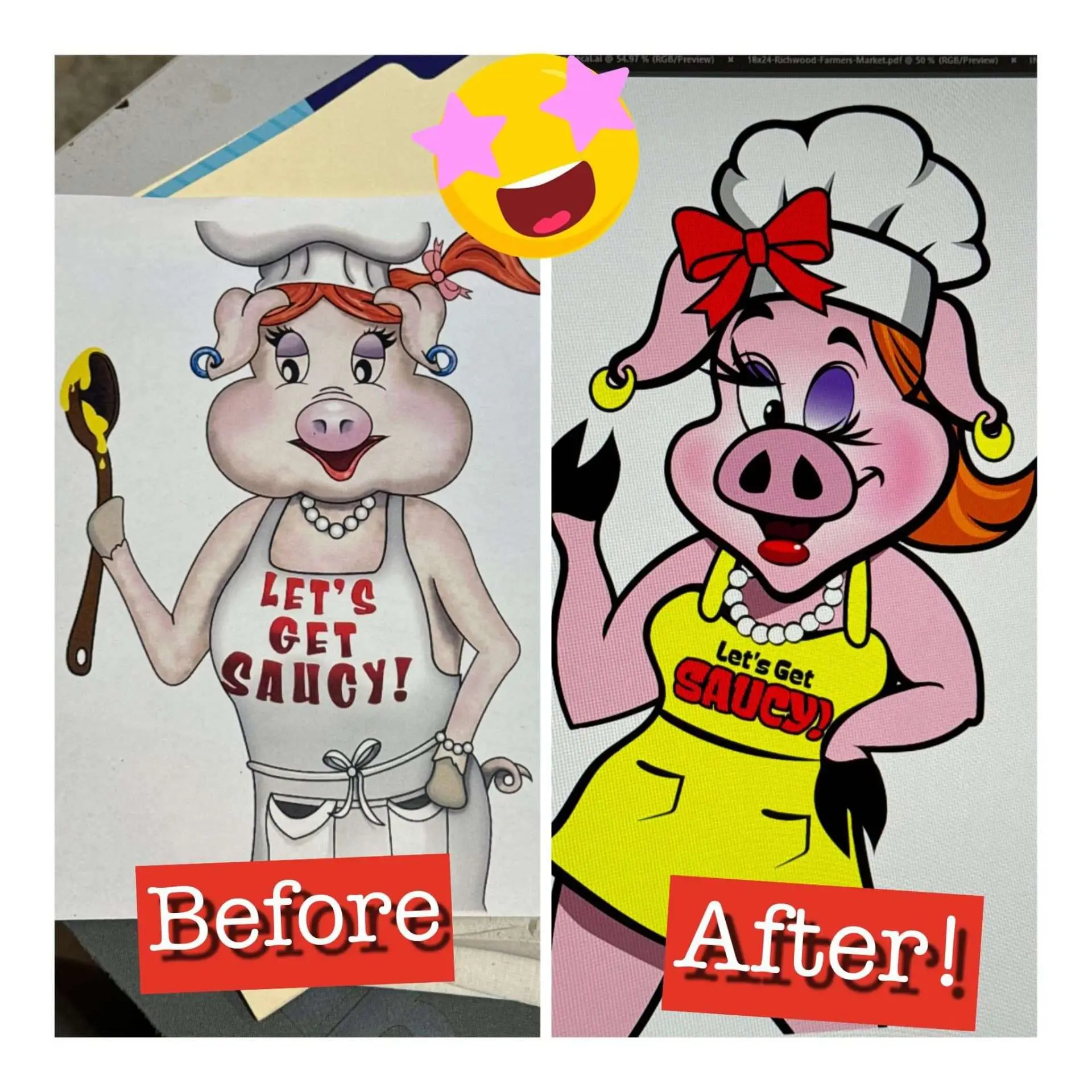
Breathing New Life into a Classic Brand: Saucy Sows Mascot Redesign
Nearly 1,500 reactions to one Facebook post! Saucy Sows has been a beloved brand for years, but Scott and Denise realized their mascot needed an update to better reflect their brand’s personality and appeal to today’s audience. They approached us with the goal of refreshing their iconic mascot while staying true to the Saucy Sows […]
Learn more →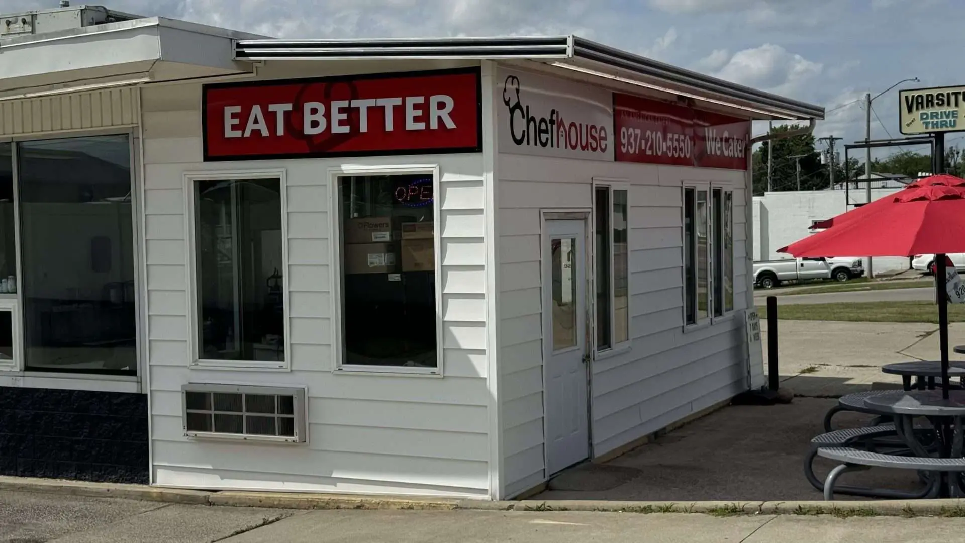
Eat Better: How We Dramatically Increased Chef House’s Visibility
ChefHouse has always been a gem on Main Street, known for its delicious, fresh, and healthy options, but for a long time, the restaurant struggled to get the visibility it deserved. Tucked away without prominent signage, ChefHouse wasn’t catching the attention of potential customers walking or driving by. They had the product and the quality, […]
Learn more →